

According to Kodak’s datasheet, Ektar 100 “offers the finest, smoothest grain of any color negative film available today.” It’s also widely known for bold color and high saturation. It's best suited for landscapes, architecture, and scenes where detail and color accuracy matter more than flexibility.
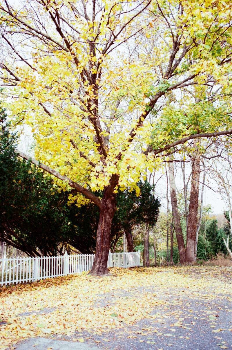
I’d been holding onto a roll of Ektar 100 for a while. I had been saving it intentionally for the fall since I’d seen how it over and made fall leaves and autumn colors pop. Harpers Ferry is a quaint, historic town in West Virginia that has some scenic hiking trails that run along the Potomac and Shenandoah Rivers. Knowing this, I figured it would be a perfect time to test out Ektar 100 for the first time since we'd be surrounded by nature and have accessible views of some fall foliage.


Parking was hard to find, so we ended up parking way up on the hill. It ended up being a really beautiful fall day. We ate at Coach House Bar & Grill, which was pretty good, popped into a few gift shops, and spent some time walking the streets.
I’m always a little nervous when shooting a new film stock for the first time. There are so many expectations built up from seeing how good other people’s results look online, and with Ektar 100 being a bit pricier than my usual go-to films, the pressure felt even higher. On top of that, fall was quickly coming to an end, so I didn’t have much time left to keep putting off shooting this roll. Eventually, I realized I just had to load the film and trust the process, even if it didn’t turn out exactly how I imagined.
By the time we made it back to the car, I had finished the entire roll of film. I was a little worried I had rushed through my shots and wasn't intentional enough but then again, I was really just testing out the roll to see how it performed and how I liked the results.
First Impressions
I chose to use Kodak Ektar 100 on a crisp fall day because it’s known for producing bold, saturated colors. That’s why I was surprised when my lab scans didn’t quite reflect what I was expecting. I was a little disappointed. The fall leaves weren’t as vibrantly orange or yellow as I had anticipated. I had imagined deep oranges, glowing yellows, and leaves that really popped—but the results were more muted than anticipated. The scans made it look as though the day in Harpers Ferry had been cloudy and overcast, rather than the bright, sunny day it actually was. I found myself wondering if I had misunderstood what Ektar 100 really excels at or if my expectations were shaped too much by edited examples I’d seen elsewhere..
Scans from the lab:


While I’ve come to rely on this lab for consistently good results, I know that every lab has its own approach to scanning and color interpretation. Thankfully, I have a flatbed scanner at home, which allowed me to rescan the negatives myself and better understand how much of the final look came from the film versus the scan. Because I remember how the day looked and felt, I was able to use that memory as a reference point while rescanning.
I scanned the film as a positive and converted it using Negative Lab Pro, taking my time to adjust color balance, contrast, and tonal response rather than relying on a one-size-fits-all scan. That process made a noticeable difference. The colors began to align much more closely with the Ektar 100 examples I had seen and loved online—cleaner saturation, richer reds and yellows, and a clarity that felt true to the scene.


Rescanning the negatives ultimately gave me a clearer understanding of both the film and my expectations going into it. What initially felt disappointing became a reminder of how much interpretation plays a role in the final image—especially with a film as precise as Ektar 100. By taking control of the scan and revisiting the negatives with intention, I was able to see the qualities that drew me to Ektar in the first place. It reinforced the idea that shooting film doesn’t end when the roll is finished; the scanning process is just as important in shaping how the images are seen and remembered.
That being said, the more time I spent with the scans—and the more I worked with them at home—the more I started to notice what was working. I continued rescanning the negatives on my flatbed scanner, making small adjustments and revisiting frames until I arrived at results that felt closer to the Ektar look I had been expecting. With each pass, the film’s strengths became clearer. The grain was incredibly fine, almost invisible in some frames, and there was a crispness to the images that felt very clean and intentional. While the colors weren’t screaming “autumn” in the way I initially imagined, they felt accurate and controlled, with strong contrast and rich detail—especially in textures like stone, bark, and shadows.

Final Thoughts
After I did my recent home scans of this roll, I'm loving it even more. It's making me miss fall. Overall, the strongest quality of Ektar 100 is its color. The film produces bright, saturated tones that feel especially well-suited to landscapes and environments where color is a primary element. While editing my scans, I made sure to exaggerate the saturation and luminance of the yellow and orange leaves to really give it that fall folliage "pop." I cant tell if I went overboard but I'm happy with it for now.
While my initial scans weren’t what I imagined—especially for fall foliage—the process of rescanning and spending time with the negatives revealed what Ektar does best: fine grain, crisp detail, and controlled, saturated color that feels deliberate rather than exaggerated. I don’t think Ektar 100 is a film I’d reach for casually or in unpredictable light. But when conditions are right and I have time to meter carefully, it’s incredibly rewarding. This roll taught me as much about my own expectations and my scanning workflow as it did about the film itself.
Add comment
Comments